Introduction
As part of the Interaction Design Practice course in the MS in HCI program at Indiana University Indianapolis, we were assigned the task of redesigning and improving the user experience of a specific flow in the current Canvas LMS (Learning Management System). Canvas is a common platform for all IU students, used primarily for academic purposes. It is also available in mobile and tablet versions.
Problem
In the current Canvas platform, users face issues with the Inbox feature, making it difficult to communicate with other students and faculty, leading them to rely more on third-party applications. Below are some of the problems we identified in the existing Canvas platform based on our research

Discovery
1. User Interviews
We conducted six interviews with graduate students from different fields and roles, including Teaching Assistants, to understand their personal experiences with Canvas. This gave us a deeper understanding of the problems users face and their expectations.
First, we framed questions and interviewed students to gather insights.
Discovery
2. Observational Tasks
Based on the insights from interviews, we conducted observational tasks, measuring time, number of clicks, and success ratio as key performance indicators (KPIs).
Discovery
3. Define
We collected and categorized all user pain points and desired features into different sections. This categorization helped us identify the areas where users face the most issues.
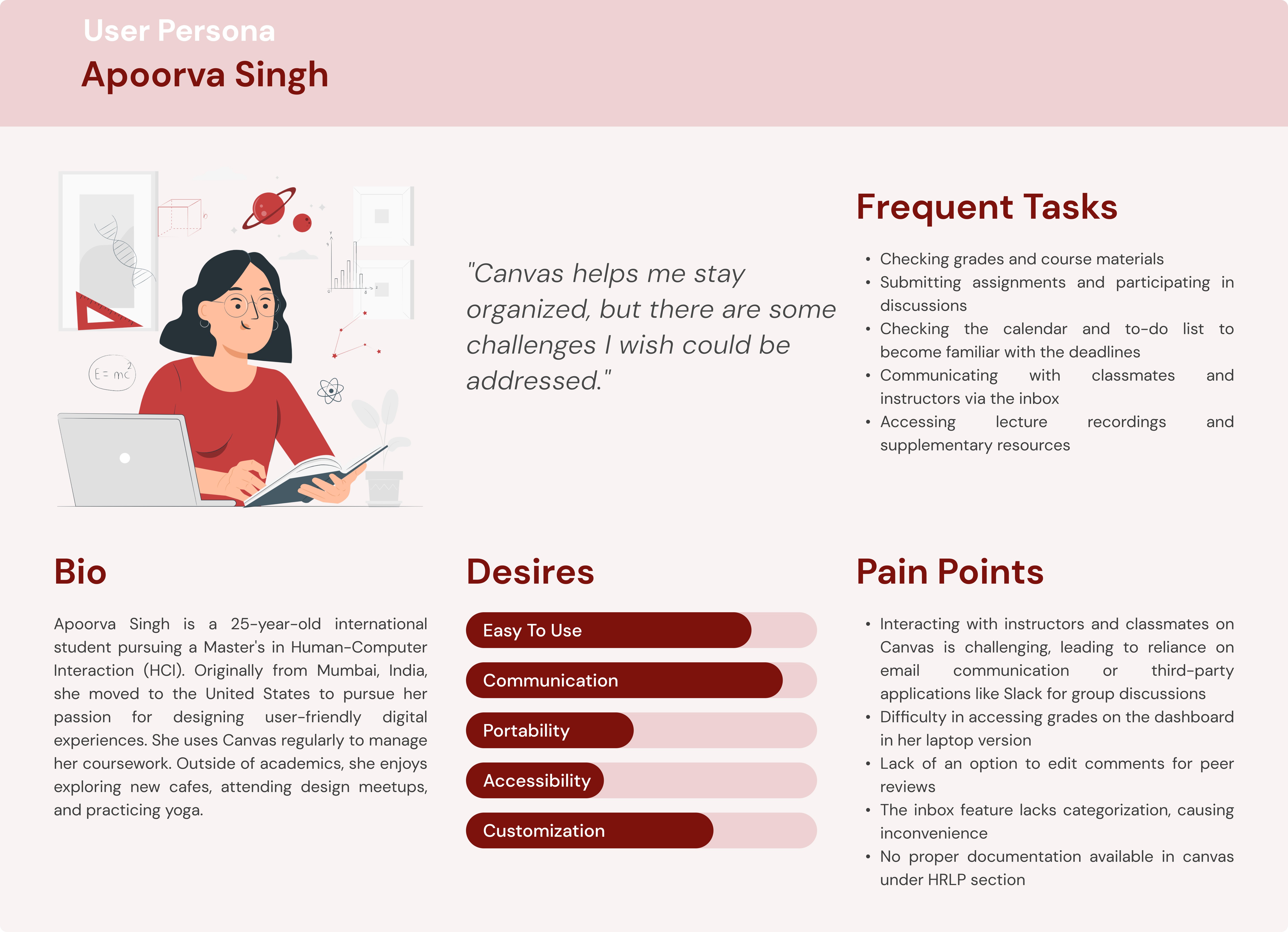
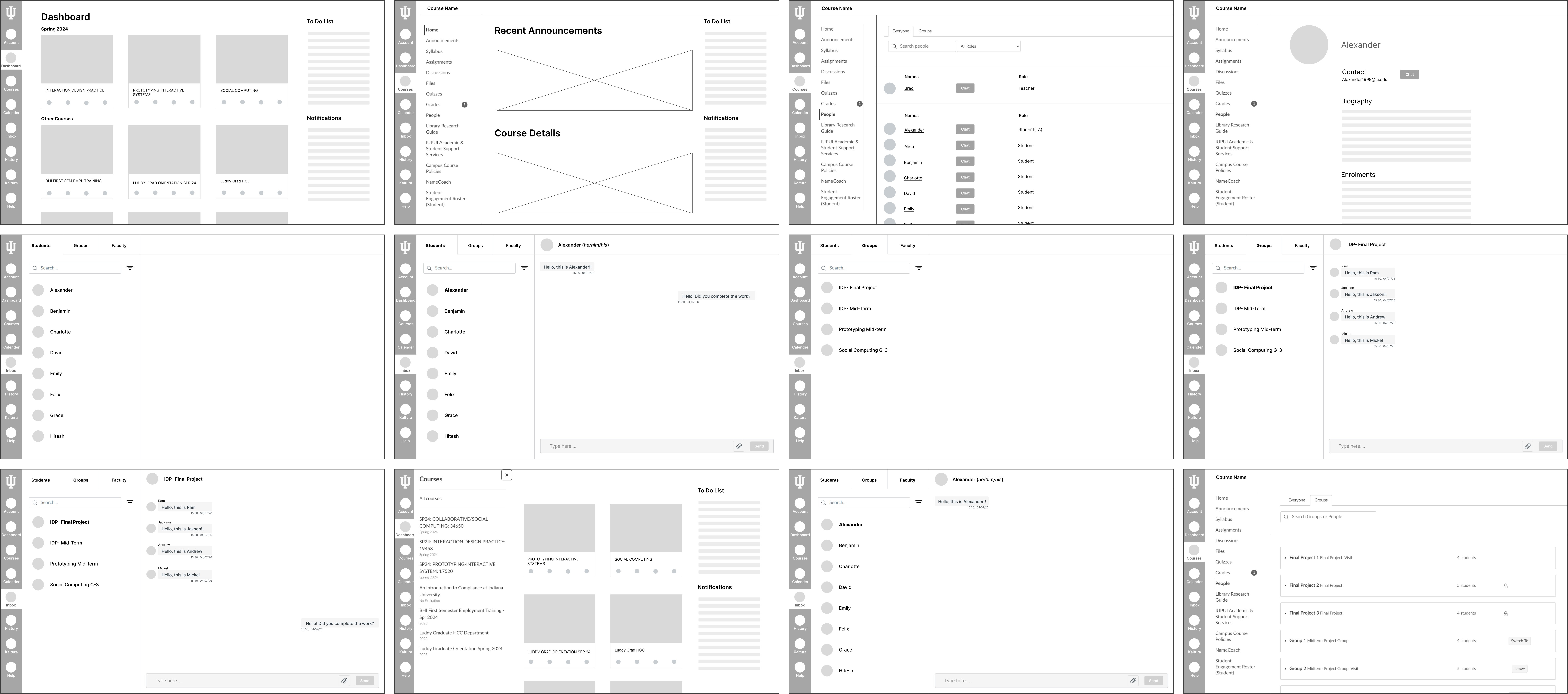
Most users reported issues with communication and expressed a strong desire for an improved communication feature within Canvas.
Project info
Scope
Design a comprehensive set of design system components for a web3 startup, with a focus on a dark theme to enhance user experience and consistency across their platform.
Process
Collaborated with the startup team to understand their brand, user needs, and technical requirements. Conducted research on dark theme usability and best practices. Developed a series of wireframes and component prototypes using Figma, ensuring they were accessible and visually appealing. Iteratively tested the components with users and refined them based on feedback.
Solution
The dark-themed design system components provided a cohesive and modern look for the web3 startup's platform. The components were well-received by the development team for their ease of use and by users for their visually appealing and intuitive interface, leading to improved user engagement and satisfaction.